Choosing and trying a theme
On the Themes tab of Website → Theme, filter by shop type and click a theme to see it in full. Nothing is saved in the preview window.
- Choose My products or Sample products to switch which products the theme shows.
- For colours, choose Theme's or My colours to check whether to keep your own main colour.
- Click Use this theme and confirm, and the theme goes live in your shop at once.
- If you change your mind, use Undo in the notice that appears to bring back your previous theme.
The editor: editing on the preview
The Customize tab of Website → Theme is your shop editor. The shop preview is on the right, two tabs, Page and Style, are on the left, and the top bar holds the device, search, Undo, Redo, History and Publish buttons. Every edit goes to a draft first and does not show in your shop until you click Publish.
- Point at a block in the preview and it gets an outline and a bar with Move up, Move down, Hide, Duplicate, Remove and Settings buttons. Click its long text, an image or an empty spot and the block is selected with its Settings panel open.
- Click a block's title, short description or button text and type straight away. Enter keeps it, Esc undoes it.
- Add a new block with the Add section button above or below the selected block. In the add window, search for a block by name or pick one by group. The Ticker comes first.
- Click the spacing label on the bottom edge of the selected block and its Settings panel opens at Spacing, where you set Space above and Space below to None, S, M, L or XL.
Switch the preview between Computer, Tablet and Phone in the top bar to check your changes. Your settings apply only to your own shop.
The Page tab: the block list and publishing
The Page tab lists every block of the chosen page in the order they appear from top to bottom. A hidden block stays in the list, greyed out and marked Hidden.
- Choose Home, Product page or Listing page with the picker above the list. Pick one of the page's ready-made layouts with the Layout button.
- Drag a row by its handle, or press the arrow keys on the handle, to change the order. Hide a block and show it again with the eye button.
- From a row's ⋮ menu choose Settings, Duplicate, Add above, Add below, Hide on phones, Hide on computers or Remove.
- Click a row and the preview scrolls to that block. Double-click it to open the block's settings. The Page button takes you back to the list.
- The Publish button shows how many changes are unpublished. Clicking it lists what changed and asks you to confirm. Once you agree, the changes appear in your shop.
- Removing a block asks for confirmation. Other edits go straight into the draft, and you can reverse them with Undo in the notice that appears or with Undo and Redo in the top bar.
- A home page has up to 20 blocks. You cannot publish while a block still has a field with an error.
- Unpublished changes are kept, so you can carry on next time. Discard removes every unpublished change.
- The Purchase area of the product page (name, price, options, buttons) is locked. It cannot be moved, hidden or removed; you can only change its style.
Block settings, spacing and devices
A block's Settings panel holds its fields and its Spacing and Devices settings. In a shop with English turned on, Mongolian and English tabs appear so you write each language separately.
- Space above and Space below: Default, None, S, M, L, XL. Default is the theme's own spacing. Between two blocks the larger of the two is used, and if either is None the gap goes away.
- Devices: Show on all, Hide on phones, Hide on computers. Previewed on a device it is hidden on, the block does not show, but it stays in the list.
- Editing a block marked All pages changes it on every page of your shop.
Style: logo, colours, fonts, shape
The Style tab lists its settings group by group: Logo and announcement, Color, Font, Shape and Product page. Settings that have no effect in the current theme are hidden.
- Logo and announcement: your logo and the Announcement line at the very top of every page.
- Color: Main color (buttons, prices, active menu), Secondary color (sales, labels) and Background. Use Back to theme default to bring back the original colours.
- Font: the body and heading fonts. Every font includes Cyrillic letters.
- Shape: Corners (Sharp, Soft, Round), button shape and more.
- Turn on Sample elements to check your style on a sample page with headings, text, buttons, cards and prices.
While the Style tab is open, clicking a heading, button or card in the preview highlights the setting that changes it.
The bottom line of the shop footer shows the DAN logo automatically if you are DAN-verified, and the e-barimt logo if you issue receipts. There is nothing to set up.
Featured products, descriptions, buttons, columns
You set the heading and layout of the Products, Posts and Categories blocks yourself. Settings left empty keep the theme's original look.
- Add the Featured products block, first in the Products and promotions group of the Add section window. If the home page shows no featured products, a suggestion to add them appears above the list on the Page tab.
- Open the Featured products block's settings, order products in the Featured products order list by dragging or with the arrows, and click Save order.
- Write the text shown above the block in the Title and Description fields. You can also click the title in the preview and type there.
- For the button, choose Theme default, Show or Hide. You can change the Button text and Button link. With an empty link, it goes to the page with all of that block's products.
- For Layout, choose Grid or Scrolling row. Computers show 2 to 6 columns, phones 1 to 2. Tablets reduce automatically to at most 3 columns.
Adding blocks to every page
Besides the home page, you can put blocks on the product page and the listing page. Choose a page with the page picker on the Page tab and the preview moves to that page. If you follow a link in the preview to one of these pages, the picker follows.
- Product page: Top, Below the buy section, Bottom.
- Product list: Above the list, Below the list.
- All pages: Above the footer. A block added here shows under each of the three page lists marked All pages, and appears on every page of your shop.
Blocks never appear on the checkout, payment, sign-in or account pages. The home page has up to 20 blocks, and the other pages up to 20 between them.
- Note or panel: title, text, colour (plain, info, success, warning) and a button. Buyers can close one placed on all pages.
- Partners: logos and links of up to 24 partner organisations, as a row, a grid or a scrolling strip.
Custom block
A custom block is one you build yourself from headings, text, images, buttons and spacers in 1–3 columns. It works in every theme and can go on every page that takes blocks.
- In the Add section window, choose Custom block in the Layout and accents group. A one-column block with a heading, text and a button is added.
- In the Settings panel, choose the Column layout, Background and Alignment. On phones the columns stack from top to bottom.
- Add a Heading, Text, Image, Button or Spacer to each column and move them with the arrows. A column holds up to 6 elements and a block up to 12. Removing one asks for confirmation.
- Click a heading or button text in the preview and type straight away. Write text in the Settings panel.
- Text: only bold, italic, links and lists are kept.
- Image: only an image uploaded here is shown. The image description is required.
- Button: Button text, Link (/search or https://…), and a Primary or Outline style.
- A block with a wrong value is kept in the draft and marked Has errors in the list. You cannot publish until it is fixed.
- In a shop with English on, translate each element's text on the English tab. An element without a translation shows in Mongolian.
Product page
Set up the product detail page in the Product page group of the Style tab. The Style item of the Purchase area row on the Page tab brings you here too.
- Visible parts: hide Similar products, Reviews and Share with their toggles.
- Choose the button style (Filled, Outlined), button colour, width (Fit text, Full width) and price size.
- Sticky add-to-cart bar: the button that stays at the bottom of the screen as you scroll on a phone. With it off, the page's own buttons remain.
Search, shortcuts and history
- Search blocks, colours, fonts, spacing, pages and actions with ⌘K (Ctrl+K on Windows) or the What do you want to change? button in the top bar. For example, type spacing and the spacing settings appear. Click a result to open and highlight that spot.
- Shortcuts: ⌘Z undo, ⌘⇧Z redo, ⌘D duplicate the selected block, Delete remove the selected block (with confirmation), Esc clear the selection. On Windows, use Ctrl instead of ⌘.
- The History button shows your last 20 publishes. Restore puts that version into the draft only. Your shop does not change until you click Publish.
- On your first visit a short three-step guide appears. Close it for good with Don't show again.
Editing from a phone or tablet
On a narrow screen the preview takes the full width, with Page and Style buttons below it. Tap one and a panel slides up from the bottom. Drag the panel up to enlarge it and down to close it.
- Tap a block in the preview and an action panel opens from the bottom: Move up, Move down, Hide, Duplicate, Settings, Spacing, Add above, Add below, Remove.
- Tap a title, description or button text and the field opens in the panel below. Type, then tap Done or Undo.
- While a panel is open, the selected block stays visible above it.
Pages and blog
Create extra pages such as About us in Website → Pages. Write the title and content with New page. Turn on Show in footer and a link appears in your shop footer.
In Website → Blog, write a title, cover image, short summary and content with New post. With the Publish toggle on, it shows in your shop; with it off, it stays a Draft. Show your latest posts on the home page with the Posts block.
Videos and social
- Click Add video in Website → Videos.
- Copy the address of a YouTube, Facebook, Instagram or TikTok video into the Video address field. A title is optional.
- Change the order with the Up and Down buttons and click Save.
Once you add a video, your shop gets a Videos page and menu item. You can add a Video list block to the home page. The player does not load until the buyer clicks a video, so the page stays fast.
Enter your Facebook, Instagram, TikTok and YouTube links on the Settings → Contact tab. They show in your shop header and footer. Turn on Show Facebook Page in footer and the official Facebook Page plugin appears at the bottom of every page.
Branches and pickup
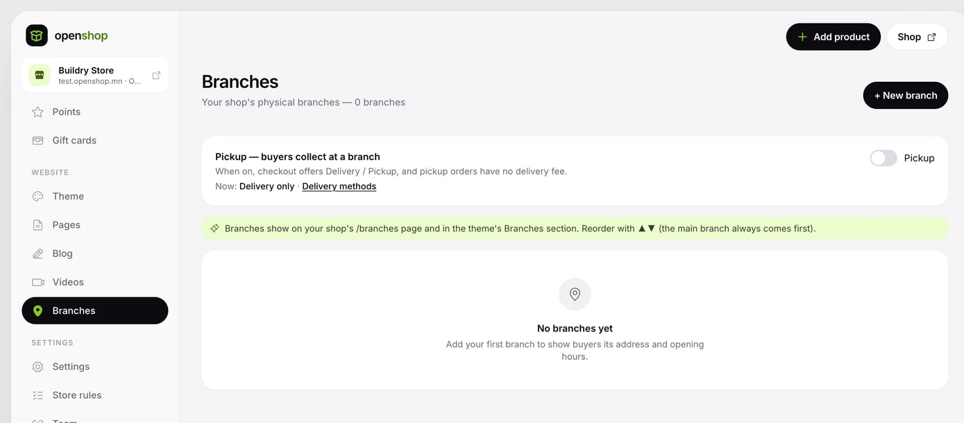
- Click New branch in Website → Branches.
- Enter the Name, City / province, District / soum, Address, Phone (up to 3), Opening hours, Photo and the map location.
- Tick the Shown in shop, Pickup point and Main branch options and save.
Branches appear on your shop's /branches page and in the Branches block. The main branch is always first.
Turn on the Pickup toggle at the top of the branch list and buyers can choose a branch that is a pickup point when ordering and collect the order there. No address is entered and no delivery fee is charged.
Delivery fees and methods
You organise delivery yourself. Set the following on the Settings → Site tab.
- Delivery fee (₮): added once per order. At 0, buyers pay no delivery fee.
- Delivery terms: a short note on how and in how many days you deliver. It shows on the product page.
- Delivery method: the Delivery and Pickup from a branch toggles. With both on, buyers choose when ordering.
Shop policies
In Settings → Shop policies, set your order terms and the information shown in your shop.
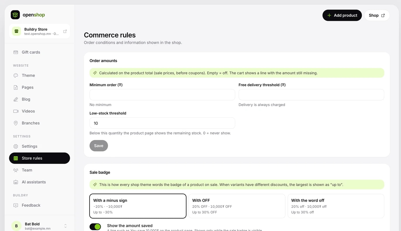
- Order amounts: the Minimum order (₮) and the threshold above which delivery costs nothing (₮). Both count the products total (at sale prices, before coupons) and are off when empty. The cart shows how many ₮ are still missing.
- Show stock below N: when stock falls below this number, the product page shows how many are left. At 0, it is not shown.
- Contact buttons: enter your Phone, Messenger, Instagram and WhatsApp and they appear together in a corner of your shop.
- Policy pages: Delivery policy, Payment policy, Returns and Terms of service. Policies you write are linked in the shop footer. Clear a text completely and save to remove that page.
Buyers can write a note or a gift message when ordering. It shows in the order details under Buyer's note. Pre-orders are turned on per product with the Pre-order toggle on its edit page.
Announcement strip and popup
The Announcement strip and Popup pages of the Online store menu set the message across the top of your shop and one popup visitors see. Both appear in every theme, in that theme's own style.
- Announcement strip: up to 3 lines, each with a link. Motion is Theme, Static, Rotate or Scroll. Use the theme's colours or pick your own. Colours whose text is hard to read on the background are not saved.
- Popup: an image, title, text, button and link. Frequency is Once, Once a day or Every visit. Choose home only or all browsing pages, and how many seconds to wait.
- Both can have a start and an end time, in Ulaanbaatar time.
- Turning either on or off asks first and saves at once. Save keeps every other change.
To ask a survey in the popup, choose Survey as the Type and pick one of your published surveys. Surveys of 1–3 Stars 1–5, NPS 0–10 or Single choice questions are answered inside the popup; others open the survey page.
A visitor who ticks Don't show again never sees the popup again. Answers that came through the popup show in the survey results as N from the popup.
Connecting your own domain
You can show your shop on your own domain, such as shop.example.com. The your-shop.openshop.mn address keeps working.
- In the Your own domain section of the Settings → Site tab, write your domain and click Connect.
- Add the A record shown on screen to your domain's DNS. We recommend adding www too.
- Once DNS has spread (15 minutes to 1 hour), click Check.
- After it is verified, the certificate is activated and the status becomes Active.
- If it is not verified within 24 hours, the domain is cancelled. You can connect it again.
- To change domains, first remove the current one with Delete.
- If your domain points to another server, you can prove ownership with a TXT record. This is optional.
Search engines
On the Settings → Search engines tab, set what shows in Google and other search results and when your shop is shared on social media. Empty fields come from the shop name, introduction and cover image automatically.
- SEO title (meta title): up to 70 characters.
- SEO description (meta description): up to 200 characters.
- Social sharing image (OG image): the wide image shown when a link is shared.
- Favicon: the square icon on the browser tab. If empty, your shop logo is used.
Change the site name on the Settings → Site tab. This name shows on your shop's home page, in the header and in search.